Range Slider
A representation of Sliders.
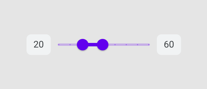
NikuRangeSlider accepts all the props as same as RangeSlider.
dart
// Using namespace
n.RangeSlider(0, 100);

// Using Niku Prefix
NikuRangeSlider(0, 100);
Example Usage
dart
n.RangeSlider(0, 100)
    ..min = 0
    ..max = 100
    ..labels = RangeLabels(start.n, end.n);
    ..divisions = 5
    ..onChanged = updateState
Customization
dart
n.RangeSlider(0, 100)
    ..labels = RangeLabels(start.n, end.n);
    ..divisions = 5
    ..overlayColor = Colors.white.withOpacity(.125)
    ..activeTrackColor = Colors.white.withOpacity(.75)
    ..inactiveTrackColor = Colors.white.withOpacity(.25)
Change Thumb Shape
dart
n.RangeSlider(0, 100)
    ..trackHeight = 2
    ..thumbShape = RoundSliderThumbShape(enabledThumbRadius: 6);